
Flashing Cart Quantity Indicator for WordPress Sites
Introduction
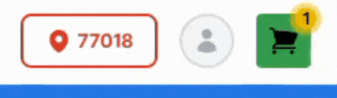
Add a subtle, pulsing badge to your shopping cart icon that flashes only when items are in the cart. This draws attention to the cart and encourages checkout.
Prerequisites
- WordPress site integrated with the InflatableOffice plugin
- Permission to edit your site’s header and/or add custom CSS
- Access to edit your header layout (Elementor header or theme header/menu)
Step-by-Step Instructions
Option A — Recommended (use built‑in styles)
1) Open your site header for editing
- Elementor: Templates or Theme Builder -> Header -> Edit with Elementor.
- IO theme or other: Open your header/menu widget or header template for editing.
2) Select the cart icon element
- This is typically the clickable icon that opens the cart. It usually updates a cnt attribute as items are added.
3) Add the CSS class
- Add: ioCartSonar
- Elementor: Advanced tab -> CSS Classes field -> enter ioCartSonar (no dot).
4) Ensure correct positioning
- If the pulse doesn’t appear, set the cart icon’s container to position: relative (via widget/style or a small CSS rule).
5) Save and test
- Add an item to the cart. The pulsing ring should appear only when cnt is not 0.
Option B — If your site does not have the built‑in style yet
1) Add the CSS
- Go to Appearance -> Customize -> Additional CSS and paste:
.ioCartSonar:not([cnt="0"]):before {
content: "";
width: 20px;
height: 20px;
display: flex;
position: absolute;
right: 0;
bottom: 0;
z-index: 2;
background-color: var(--e-global-color-accent, green);
border-radius: 30px;
isolation: isolate;
--ring: var(--e-global-color-accent, green);
--sonar-scale: 2.6;
--sonar-time: 2s;
border: 2px solid var(--ring);
animation: cart_sonar var(--sonar-time) ease-out infinite;
}
@keyframes cart_sonar {
from { transform: scale(1); opacity: .55; }
80% { opacity: 0; }
to { transform: scale(var(--sonar-scale)); opacity: 0; }
}
@media (prefers-reduced-motion: reduce){
.ioCartSonar::after, .ioCartSonar::before { animation: none; opacity: 0; }
}
2) Add the ioCartSonar class to your cart icon (see Option A steps 1–3).
3) Save and test with an item in the cart.
Positioning tips
- If the ring is misaligned:
- Adjust right/bottom in the CSS (e.g., right: 6px; bottom: 4px;).
- Ensure the icon or its container has position: relative.
- Increase z-index on the icon or reduce overflow: hidden on the container if it clips.
Feature Options & Parameters
- Size and timing
- --sonar-scale: Controls pulse size (default 2.6).
- --sonar-time: Controls pulse duration (default 2s).
- width/height: Size of the badge circle (default 20px).
- Color
- Uses var(--e-global-color-accent, green) by default (Elementor global Accent color).
- Override by setting --ring or background-color on the element or in a custom rule.
- Motion preferences
- Honors prefers-reduced-motion; animation is disabled for users who request reduced motion.
- Activation logic
- The badge only appears when the element’s cnt attribute is not 0: .ioCartSonar:not([cnt="0"])
- Ensure the class is applied to the same element that receives the cnt attribute (typically the cart icon element in IO themes).
Use Cases
- Draw attention to the cart after a customer adds an item.
- Improve visibility of in-progress orders on catalog/category pages.
Troubleshooting & FAQs
- The ring never appears
- Confirm you added ioCartSonar to the cart icon element.
- Add an item first; the badge only shows when cnt != 0.
- Verify the icon element updates a cnt attribute (inspect the element while adding/removing items).
- Ensure the element is visible on all pages you test.
- If your site doesn’t include the style yet, add the CSS from Option B.
- The ring is misaligned or clipped
- Set the icon container to position: relative.
- Adjust right/bottom or width/height values.
- Reduce/disable overflow: hidden on the container or increase z-index.
- I don’t use Elementor for my header
- Add the ioCartSonar class in your theme’s header/menu icon settings or template markup. If unavailable, use Option B CSS and target the exact selector for your header cart icon.
- How do I change color/size/speed?
- Override CSS variables:
- Example:
.ioCartSonar { --sonar-scale: 2.2; --sonar-time: 1.6s; --ring: #2563eb; }
- Or change width/height and border thickness in the rule.
- How do I turn this off?
- Remove the ioCartSonar class from your cart icon, or override with:
.ioCartSonar::before { animation: none !important; opacity: 0 !important; }
Related Links
- WordPress Shopping Cart Settings
https://rental.software/support/knowledge-base/article/wordpress-shopping-cart-settings
- Your WordPress Site – Overview
https://rental.software/support/knowledge-base/article/wordpress-wshopping-cart-integration_1
- Add an Elementor Button to Open the Cart
https://rental.software/support/knowledge-base/article/how-to-add-an-elementor-button-to-open-the-cart