You can create custom reports, create graphical charts, apply filters, and add them to a dashboard.
Walk-through on creating some charts to measure referrals and event sales by book date.
- Go to Leads, and click customize report at the bottom-left.
- In the pop-up select your columns.
- Set the drop-down to Create New and type in a name for the report.
- Set the grouping and sorting (this is optional and should probably be avoided in most cases)
- Click Save, then View. The system will attempt to generate a graph automatically. You may need to click edit chart at the top to adjust it. This chart is showing how much the lead totals are grouped by referral type.
- If we want to see the count instead of the $ amount, then we need to close the page and add Count Grouped Items to the Report Columns. Then hit Save & View again.
- Again, hit edit chart to make sure the chart is configure correctly. FYI - the x-axis referrals to the data at the bottom of the chart and the y-axis is for the data on the left side of the chart. When using a Bar Chart you must set a Group By on the Chart settings pop-up.
If we want to see the referrals over time instead of just totals, we can adjust the chart as follows:
- Another useful feature, is you can group the data on the chart by month.
- Once it looks correct, hit add to dashboard to see it under Overview -> Charts.
Revenue Booked Over Time
Below are the settings if you want to see how much revenue is booked over time.
When on the leads screen you can filter the leads before viewing a report and it's chart, but when you are on Overview -> Charts you have to apply a saved filter to a chart when you add it to the dashboard. This could be useful if for example you want a sales chart showing several years worth of performance and you want the same chart showing only the last year of data only.
Create a new filter.
Save the filter.
Below you'll now see we have the same Event Sales chart on there, once for All leads, and once for the 90 days filter we created above.
Below, you'll see we set the Event Date Range at the top. This is a way to quickly set an additional filter to be applied. Currently it only affects the event date range, so it may not make sense to use on the reports that are using book date.
So we showed two examples on how to see referrals and event sales by book date. Additional ideas of charts you may want to see:
# of leads by create date
average revenue per event by event date
# of confirmed/complete events by create date
# of leads by customer type
average revenue by customer type
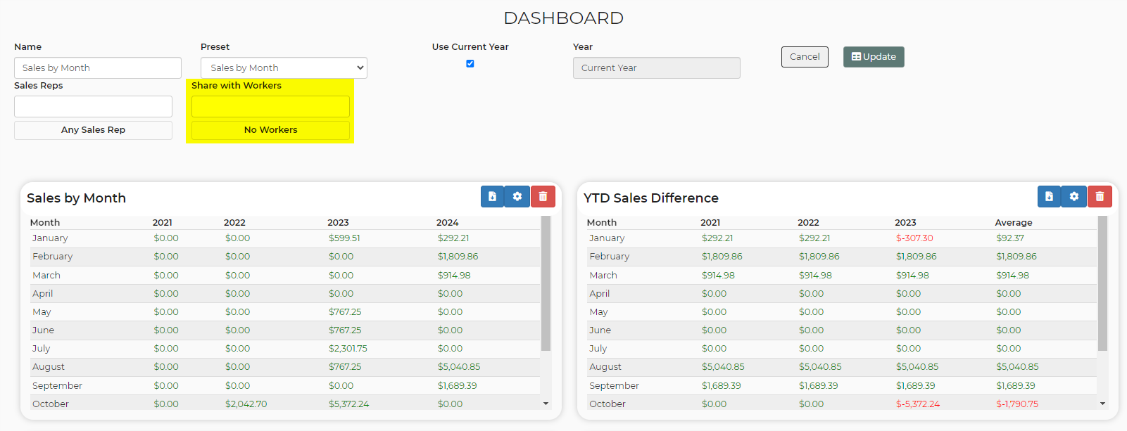
You can now specify sales reps and location (when you have access to more than one location) on preset dashboard widgets.

Creating a Sales Rep-Specific Report
You can now use a dynamic variable in your report filters to automatically display data that is relevant to the logged-in worker or sales rep.

This feature eliminates the need to create and maintain a separate copy of a filter/report for each sales rep. Instead of having to create a filter that says, for example, "Sales Rep is Sally" you can create one filter that uses a dynamic variable that automatically knows who is logged in.
When a sales rep views the report from their worker account, the system will compare their name against leads' sales rep field to only show their results.
This saves significant time and effort while ensuring that each sales rep sees only their own relevant information.
Share Dashboards
You can also share your dashboards with your workers. Simply select on the dashboard, select the settings wheel, and choose a worker you'd like to share this dashboard with.


