
Request for UI enhancement on Packages/Bundles - Development
I would like to request a rework of the product page UI of packages/Bundles. Right now, they are not intuitive and are kind of confusing, especially when it comes to selecting modular/variations to items. As a result, I have opted to have my bundle as a standard inventory item because it makes selections a bit more clear, but as you can guess, it’s still not perfect.
I’ve attached a mock-up of a product page for a package/bundle. Based on this mockup, a message at the top would tell you how many items need to be selected and how many have been selected in the package, so the customer doesn’t get confused. (Mine customers already have gotten confused)
I’d suggest including all products AND THEIR VARIATIONS as tiles on a grid with photos and the full titles. Right now, photos are very small and titles get cut off which isn’t very user/friendly. I’d also like to see a selection box (or radio buttons, etc) that indicate when something has been selected.
 The same question
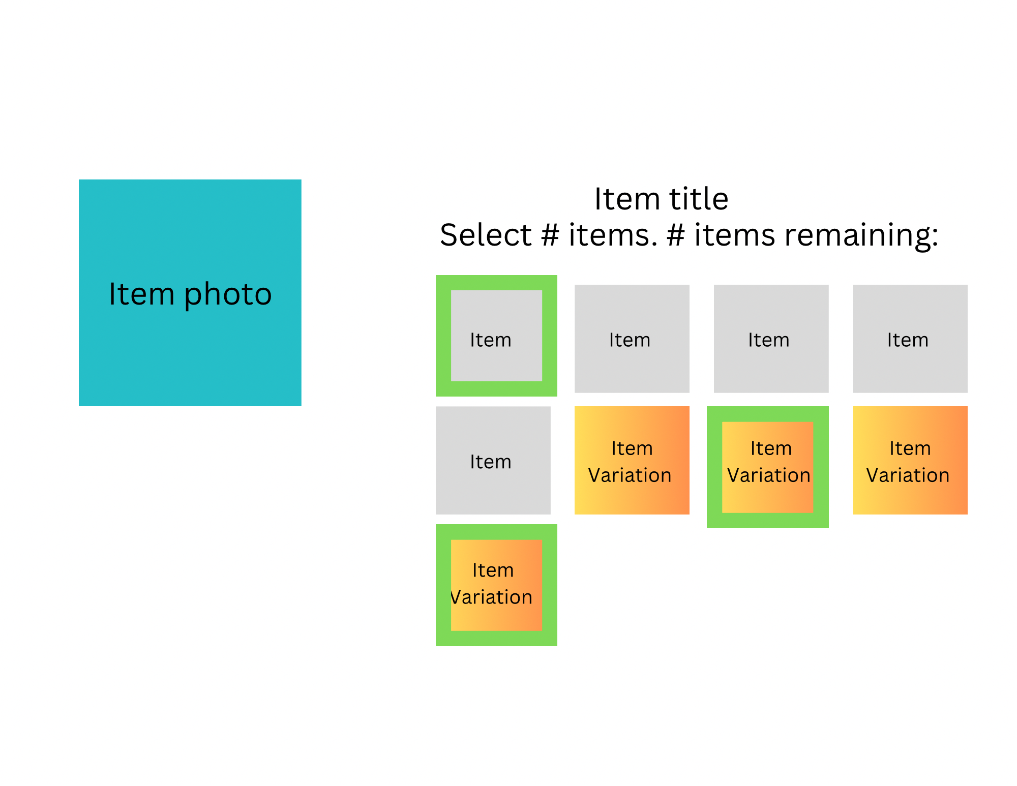
Our developers are currently working on an overhaul of how are packages display on the sites. These improvements should be done sometime in the fall. Once this is released we can see about any changes you would like made.
Our developers are currently working on an overhaul of how are packages display on the sites. These improvements should be done sometime in the fall. Once this is released we can see about any changes you would like made.
Replies have been locked on this page!